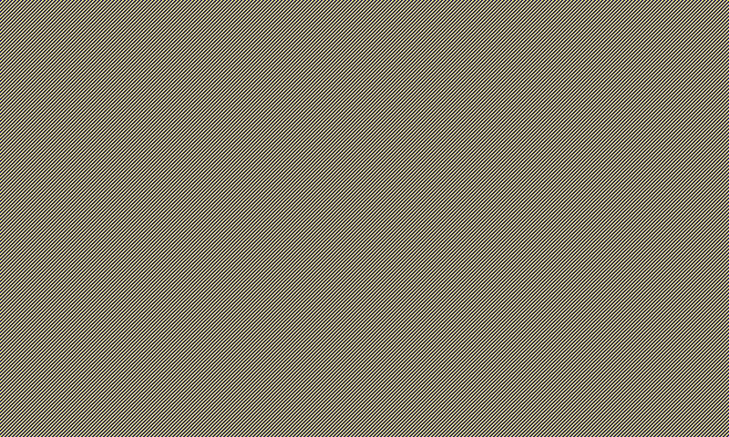
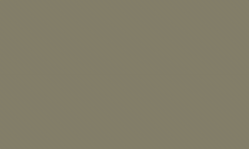
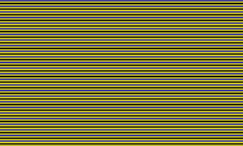
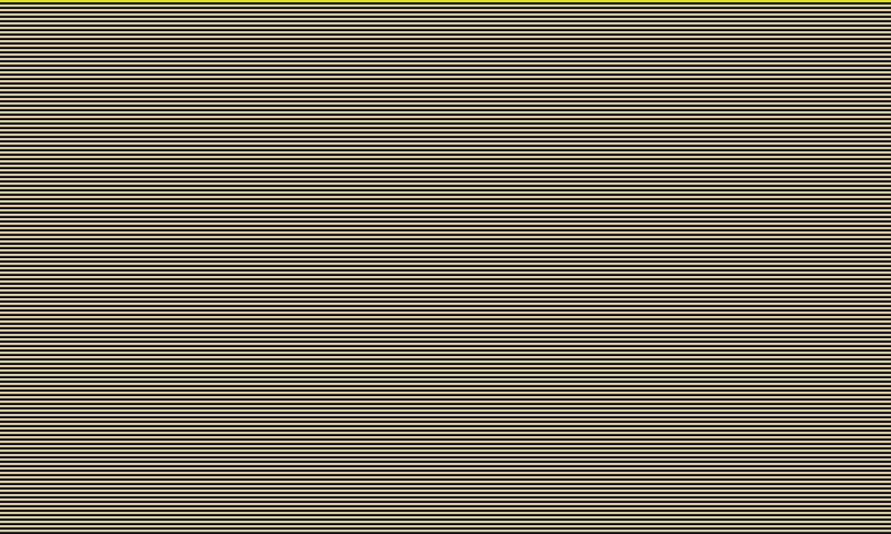
Pixel arrangement and measured color on a six-state e-paper display
Independent engineering project · Investigation in progress
I have long been fascinated by the way e-paper creates images with reflective pigments instead of glowing pixels. Spectra 6 was my first color e-paper display, and I wanted to understand how it made color and whether I could improve the result.
I began with an experimental ICC profile, a color-management description of a fixed rendering-and-display setup, applied before Pimoroni's image conversion. While evaluating the display, I found something unexpected: rearranging the same native colors could change the measured output. That surprise led to controlled pattern tests across pixel arrangement, patterned extent, presentation history and image surroundings. Understanding those measured behaviors is the center of this investigation; prediction-guided rendering is a future direction, with reliable prediction and better image reproduction still open questions.
What the experiments showed
A useful first improvement: an experimental profile reduced average color error in a measured 133-color grid, using the same image renderer.
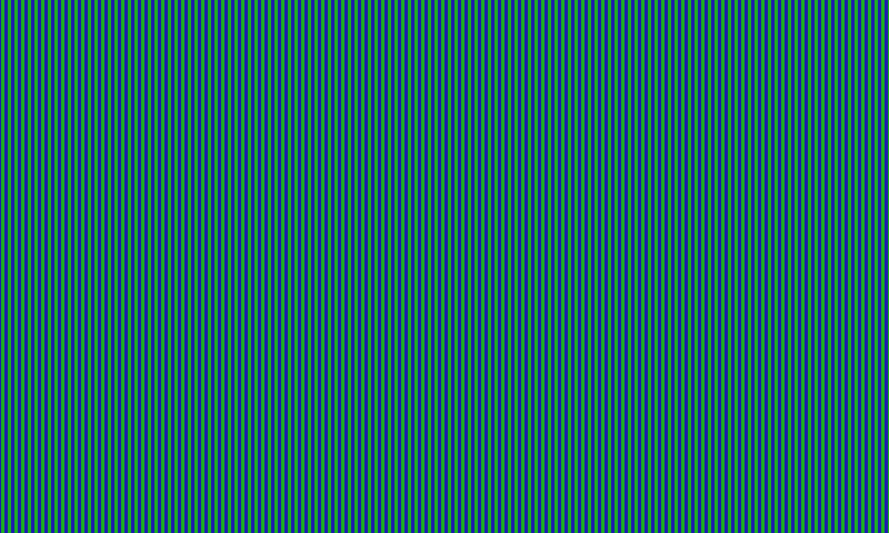
Pixel organization mattered: equal native-color counts did not guarantee equal measured output, across more than blue/green stripes.
Both large and small differences: some arrangements measured very differently; others measured close to each other. Redisplaying identical pixels and changing the image around a region raised further questions about when its color would repeat.
Why the pixel pattern matters
Rendering intermediate colors with six pixel states
Most conventional RGB display systems create a requested color by varying
the red, green, and blue channel output within each pixel. At the controller
interface used in this project, a Spectra 6 pixel is instead assigned one of
six native color states: black, white, red, yellow, green, or blue.
To create colors between those native states, a renderer distributes them
across neighboring pixels. This is spatial color mixing, often called
halftoning or dithering. From a normal viewing distance, the small pattern can
blend into an intermediate color. There is no native cyan or magenta state at
this controller interface; those and other intermediate colors depend on spatial mixing.
The renderer still has to choose an exact pixel arrangement. That makes the
pattern part of the color-generation problem, not merely a decorative detail.
Conventional RGB control
Vary three channel levels inside a pixel. Example: 8-bit sRGB values from 0 to 255.
R 64
G 160
B 208
Six-state pixel controlThis renderer selects native states, then arranges them across neighboring pixels.
BlackWhiteRedYellowGreenBlue
Why arrangement matters:
spatial arrangement can change measured color, so useful forecasts may need more
than color proportions. We can also compare rendering methods directly on images
while prediction remains incomplete. An experimental ICC profile describes a
declared rendering/display condition; its usefulness and limits still need measurement.
For the physical display technology, see
E Ink's explanation of how electronic ink works,
including the four-particle system used by Spectra 6. The pigment system inside
the screen and the six color states available to this project's image renderer
are different layers.
Enlarged pixel-level teaching diagram. The checkerboard uses two of the panel's six native states to show spatial mixing; measured appearance is evaluated later from spectra and XYZ.
The display and the software behind it
The hardware I used is the Pimoroni Inky Impression 7.3-inch, a color e-paper display for DIY electronics projects that connects to a Raspberry Pi. It combines E Ink Spectra 6 panel technology with Pimoroni's board and Python software and image examples.
Pimoroni's image-conversion software is the starting renderer here. It takes an ordinary RGB image, chooses among the six native states, and distributes those choices across neighboring pixels using dithering. I could therefore begin with a working image display and ask whether measured color information could improve its choices.
E-paper displays for DIY projects
Modules like this let people build their own picture frames, signs, and other devices without designing the display electronics from scratch. Other suppliers, including Waveshare and Good Display, also provide color e-paper hardware with example code. Their software and image-preparation routes differ; the Pimoroni route tested here is one specific implementation, not a result for every Spectra 6 product.
The first color-managed route
An experimental profile improved the first color-grid results
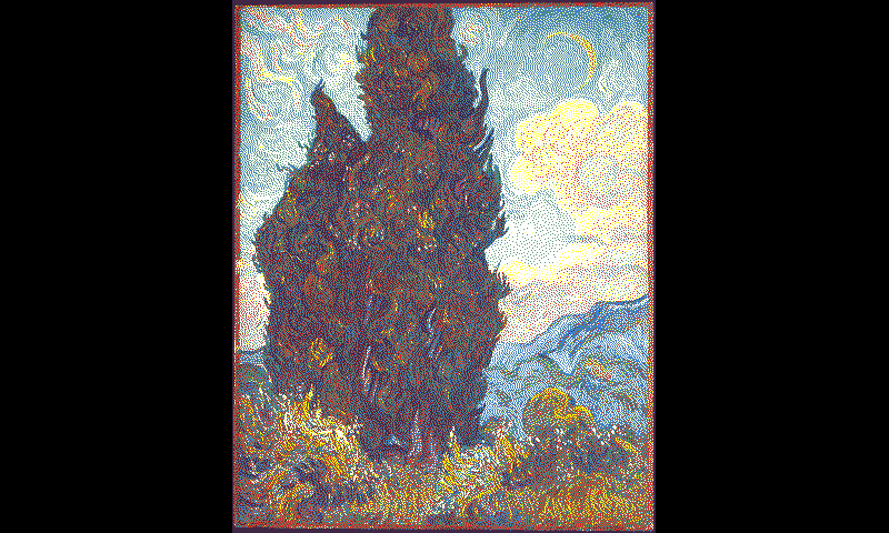
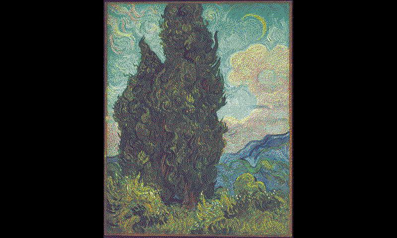
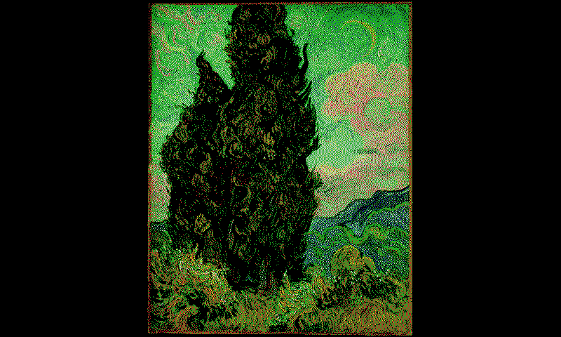
My first experiment kept Pimoroni's renderer and added color management before it. Here, the experimental ICC profile described the color response of the rendering-and-display setup under its characterization conditions, so a color-management system could translate image colors for that fixed process. I used it to convert the source sRGB image into new RGB values intended for this display, then passed those values to the same Pimoroni renderer.
Original routesRGB image→Pimoroni renderer→Six-state pixels on the display
With color managementSame sRGB image→ICC color conversion→Same Pimoroni renderer→New six-state pixel choices
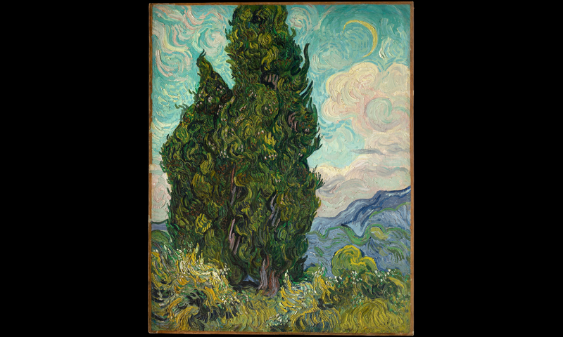
Source sRGB image
Stock six-state pixel map
ICC-managed six-state pixel map
Renderer outputs for Vincent van Gogh's Cypresses, from The Metropolitan Museum of Art. The stock and ICC-managed views are the generated six-state pixel maps, displayed here with this project's measured native-state reference colors. The 133-color comparison below supplies the optical measurement of the two routes.
I could also see the difference when displaying the images on the physical panel. That is a visual observation; the numerical comparison below comes from a separate color grid.
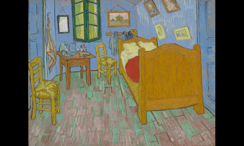
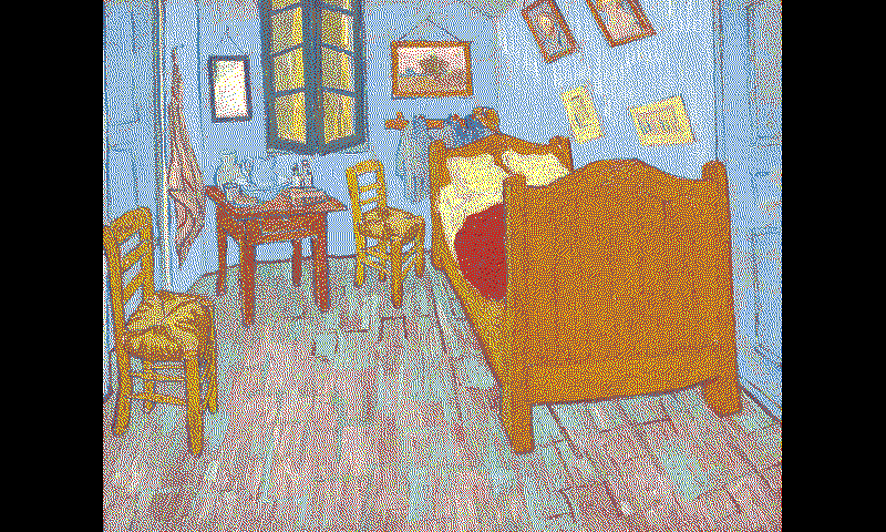
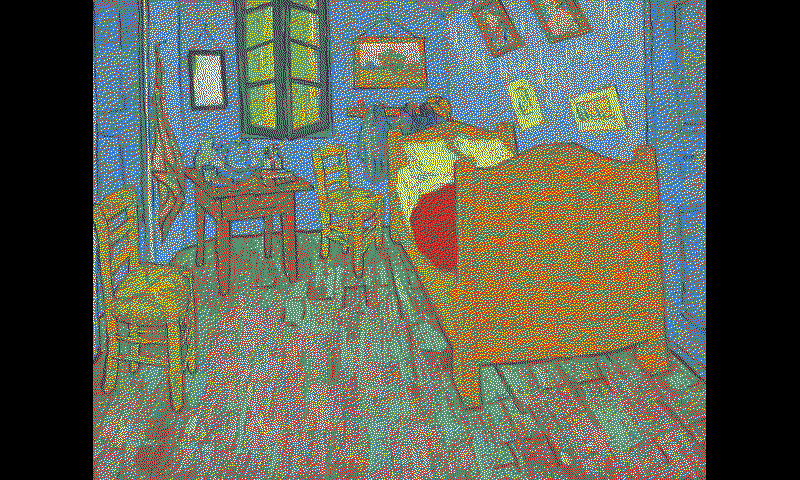
See the same comparison on The Bedroom
Source sRGB image
Stock six-state pixel map
ICC-managed six-state pixel map
Vincent van Gogh, The Bedroom, Art Institute of Chicago. The stock and ICC-managed views are generated six-state pixel maps displayed with the same measured native-state reference colors.
Lower average error on a separate 133-color grid
The generated pixel maps show which native-state choices changed. A separate test measured 133 source colors to compare the routes numerically. Lower DeltaE00 means closer to the requested color. Under that campaign's conditions, the dense ICC-managed route had a lower average color error than the stock route.
Measured color error against the 133 source colors, DeltaE00
Rendering route
Mean error
Largest error
Stock renderer
19.9922
42.1941
Sparse ICC + renderer
12.2568
26.4508
Dense ICC + renderer
11.2006
23.7069
The optical comparison used a separate 133-color grid rather than the paintings shown above. Errors used measured-media-relative D50 Lab against each requested target, averaging repeated errors per source and then the 133 source values equally. The dense route had the lower overall mean while individual colors varied. This development comparison applies to the tested renderer, display and measurement condition.
What the two experimental profile versions describe
“Sparse” and “dense” refer to the color grids used to construct the profiles, not the display's pixel density. The dense version used a modeled grid built from measured native states and an optical mixture model. The artwork route used relative-colorimetric conversion before the unchanged palette separation. This early Argyll-based experiment is distinct from the device-neutral ICC profile-writing tool now being developed.
Adding the ICC conversion changed the pixels Pimoroni chose and reduced average error on the measured grid. To improve pixel selection further, I continued measuring the display's color response. Those measurements exposed an unexpected dependency: keeping the color proportions the same did not always keep the measured color the same.
The measurement that changed the question
Equal color counts produced different measured colors
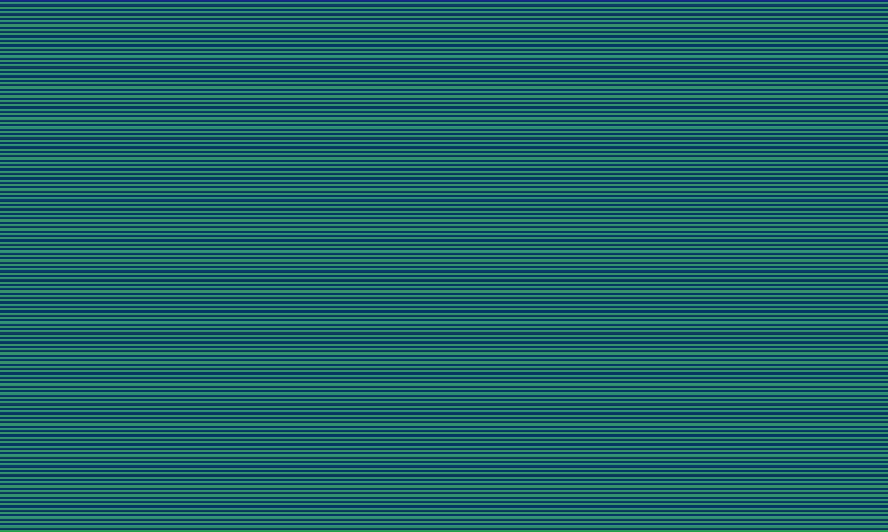
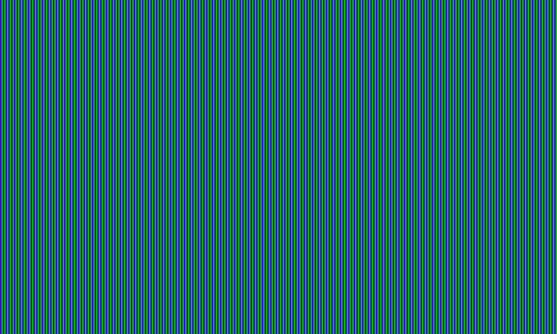
The first clear comparison used blue/green pixels: horizontal rows and vertical columns with the same counts gave different readings. I checked the digital patterns, repeated the measurements, and varied their construction. H/V stripes became a useful diagnostic, not the limit of the investigation. The wider question was which pixel arrangements a renderer could use to produce predictable color.
A pixel payload is the digital data that tells the display which native color state to use at each pixel position. It specifies the pixel arrangement, not the color of the reflected light. The driver packs those state choices into bytes for the display.
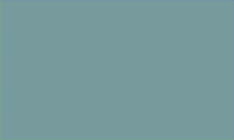
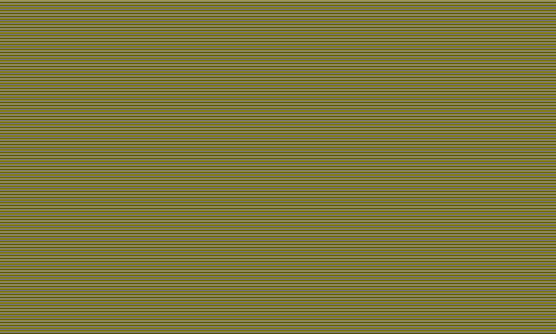
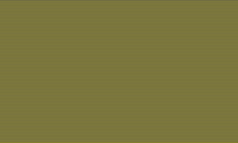
A simple area-count description would treat these two patterns alike. These enlarged grids reproduce the repeating row and column rules used in the test.
Each full 800×480 pixel map contains 192,000 blue and
192,000 green pixels. Only their spatial organization differs. The measured spectrum
and color coordinates below show the optical result.
Horizontal one-pixel rows · half blue, half greenVertical one-pixel columns · the same color counts
B = blue; G = green. The letters label native states; the actual payload is encoded as bytes. These grids illustrate the pixel instructions, not predicted appearance or photographs of the panel.
A larger difference: the black/yellow patterns
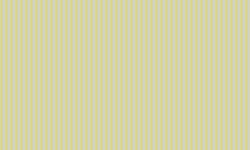
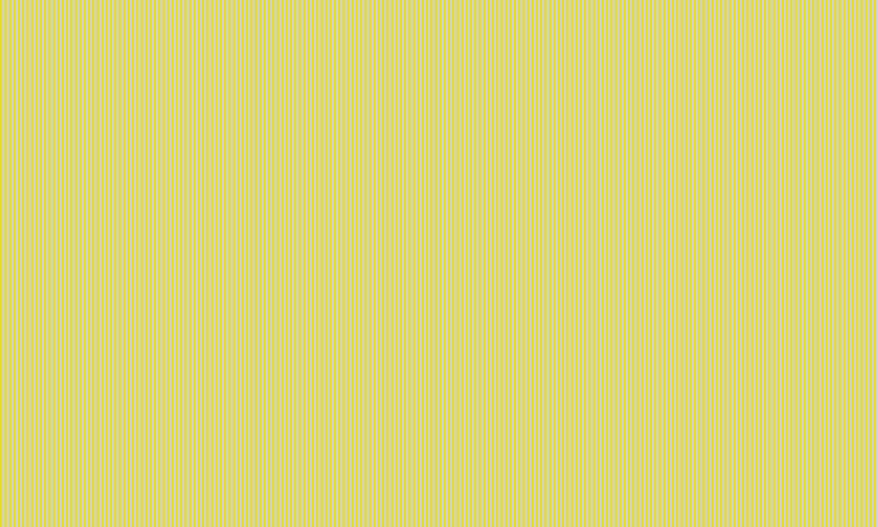
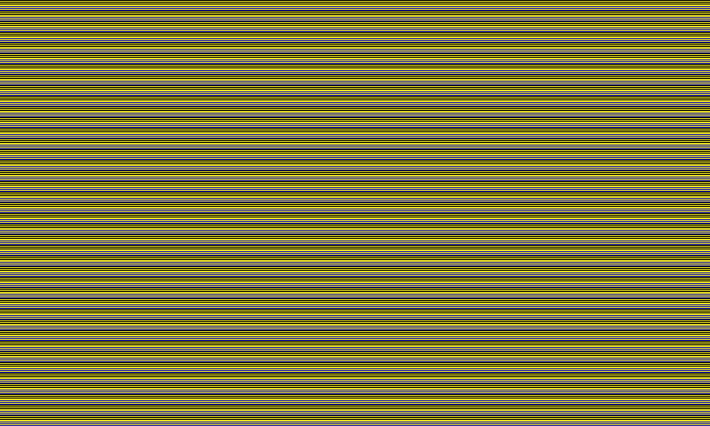
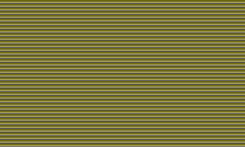
Blue/green prompted the investigation. Later, a one-pixel black/yellow comparison showed a much larger lightness difference. The two curves show how much light each horizontal and vertical pattern
reflected at each wavelength. The lower curve shows their wavelength-by-wavelength difference. The
accompanying color coordinates and distances describe different parts of the
same result.
This interactive plot requires the measurement data. The findings and example values remain available in the text.
One exact one-pixel black/yellow comparison,
measured twice in each direction. The interactive atlas shows all four
readings.
Where could the measured difference come from?
The native colors and their proportions stayed the same; their positions changed. Some rearrangements gave different readings and others stayed close. Counting colors alone could not describe all the results. To understand why, I needed to separate the pixel instructions from what the display produced and what the meter collected.
Source image and desired colorsThe picture we want to reproduce.
Color conversion and rendererChoose native states and their positions.
Update and historyThe preceding images, update sequence and operating conditions.
Physical displayThe reflective state the panel actually reaches.
Measurement setupLight, meter position and how strongly different parts of the spot contribute.
Light collected by the meterA sample of the display's optical output.
Measured colorSpectrum, then XYZ and Lab under the stated convention.
Viewing conditionsLight, angle, distance and the surrounding image.
Appearance to a viewerA separate question, not established by these meter comparisons.
Predicted colorPixel map + recorded history or measurement conditions, when modeled.
Did the forecast match?Predicted color versus measured color.
Did we reproduce the goal?Desired color versus measured color.
Process relationships
The source image and desired colors enter color conversion and the spatial renderer, which produces the exact native-state pixel map and payload.
The payload, together with the update sequence, display history, and operating conditions, leads to the physical displayed state.
The display output, together with illumination, meter position, and spatial weighting, determines the light collected by the instrument and the resulting spectrum, XYZ, and Lab measurements.
The display output and viewing conditions also contribute to appearance for a viewer, which these meter comparisons did not establish.
A candidate model predicts measured color from the pixel map and its declared inputs. Comparing that prediction with the measurement tests forecast accuracy.
Comparing the desired color with the measured color asks a different question: whether the rendering process reproduced the goal.
Conceptual dependency map, not a diagnosis of the cause. Arrows connect stages and comparisons; they do not show which physical mechanism produced the differences.
An exact pixel map is an instruction to a physical display, not a measurement of the color it will produce. The panel must form the image, and the meter samples the light it returns. A prediction is a forecast of that measured result, not another set of pixel instructions. These distinctions led to spatially informed prediction tests and comparisons of rendering methods.
Grouping pixels reduced some stripe differences, but it did not consistently make arrangements measure alike: a separate four-color comparison gave a larger difference with larger blocks. See that comparison.
How to read the spectra, color distances, and repeated readings
Different measurements answer different questions
The black/yellow example combines two questions: how did the reflected spectrum change, and how did the resulting color change? The blue/green and red/green examples below show why their answers need not track one another. Spectral RMS is useful because it
summarizes the average size of a difference across the measured wavelengths.
It does not say what either color was, which way the color moved, how far apart
the colors are perceptually, or whether a model predicted either one.
RMS means root mean square. At each wavelength, the vertical
mean spectrum is subtracted from the horizontal mean spectrum. RMS squares those
signed differences so positive and negative regions cannot cancel, averages the
squared values, and takes the square root. The result is therefore an unsigned size in
percentage points. A value such as 1.58 pp RMS is not automatically large or
small; it needs the absolute colors, signed spectral shape, DeltaE00 color
distance, and repeated-reading movement beside it.
Each curve is the mean of two readings from one four-reading
comparison. The same native plotting style is used later in the interactive
atlas, where all four individual spectra can also be inspected.
Blue / green
Higher spectrum difference, smaller color distance
This interactive plot requires the measurement data. The findings and example values remain available in the text.
Average spectrum difference
1.97 pp RMS
Color distance
DeltaE00 3.31
Repeated-reading movement
H 0.271 pp · V 0.534 pp RMS
Descriptive context, not uncertainty
Red / green
Lower spectrum difference, much larger color distance
This interactive plot requires the measurement data. The findings and example values remain available in the text.
Average spectrum difference
1.58 pp RMS
Color distance
DeltaE00 15.19
Repeated-reading movement
H 0.144 pp · V 0.286 pp RMS
Descriptive context, not uncertainty
Measured color: XYZ and Lab
Where the horizontal and vertical
patterns landed in standard color coordinates. These are the values a future
color model must predict. CIE colorimetry recommendations define the underlying conventions.
Direction of the change
Which way lightness, chromatic components
and each wavelength moved. Direction disappears in an unsigned magnitude.
Perceptual distance: DeltaE00
How far apart the two measured
colors are under the stated white-reference convention. It is a distance, not
automatically a visibility threshold. See Luo, Cui and Rigg (2001) for the development of CIEDE2000.
Spectrum difference: RMS
The unsigned root-mean-square size
of the wavelength-by-wavelength difference. Useful, but not the color itself
and not a direction.
Why the distinction matters: in the
all-pair study, a one-pixel red/green pattern had lower spectral RMS than
blue/green (1.58 versus 1.97 percentage points) but a much larger DeltaE00
color distance (15.19 versus 3.31). This does not rank the pairs; it shows that spectral magnitude and
perceptual color distance answer different questions. Explore every measured pair and width.
Color-science papers and calculation references
Error diffusion: R. W. Floyd and L. Steinberg (1976), An Adaptive Algorithm for Spatial Greyscale, Proceedings of the Society for Information Display 17(2), 75–77. This is the algorithm's original publication; the particular Pimoroni/Pillow path is a software implementation inspected for this project.
Color difference: M. R. Luo, G. Cui and B. Rigg (2001), The development of the CIE 2000 colour-difference formula: CIEDE2000, Color Research & Application 26(5), 340–350. The paper develops the color-distance formula used here.
Color coordinates and reference light: CIE 015:2018, Colorimetry, fourth edition, covers standard observers, illuminants, XYZ, color spaces and color differences. The CIE also publishes its D50 spectral data.
These references explain the measurement language. The pattern comparisons, forecast outcomes, and chosen error limits on this page come from this project's experiments.
Could the image conversion be creating the unexpected differences?
An ordinary photograph starts as RGB values. Pimoroni's image converter chooses how to represent those colors using the display's six native states, including how to spread them across neighboring pixels. That made image conversion an early suspect.
For the controlled pattern tests, I chose the pixels directly. I specified the native color at every pixel instead of asking Pimoroni to choose a dithered pattern from an ordinary RGB image. I then checked that the pixel buffer produced by the vendor software matched the intended state map and color counts before displaying it. Because the saved buffer matched the pattern I had designed, the unexpected differences were not caused by the image converter choosing different pixel colors or rearranging them.
The Pimoroni software and hardware still packed, sent, and refreshed those exact patterns on the display. This check isolated the image-conversion choice, not every part of the system. The source used exact entries from the driver's palette; its set_image conversion still ran, but its output was checked to leave the intended native-state map unchanged. Native-state packing, the low-level driver, the refresh sequence and the panel itself were still involved. Verifying the sent pixels does not establish that every physical pixel reached its intended optical state.
Could the measuring instrument be creating the difference?
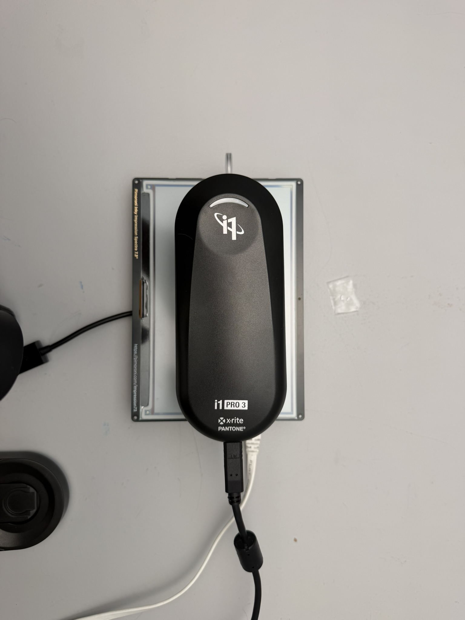
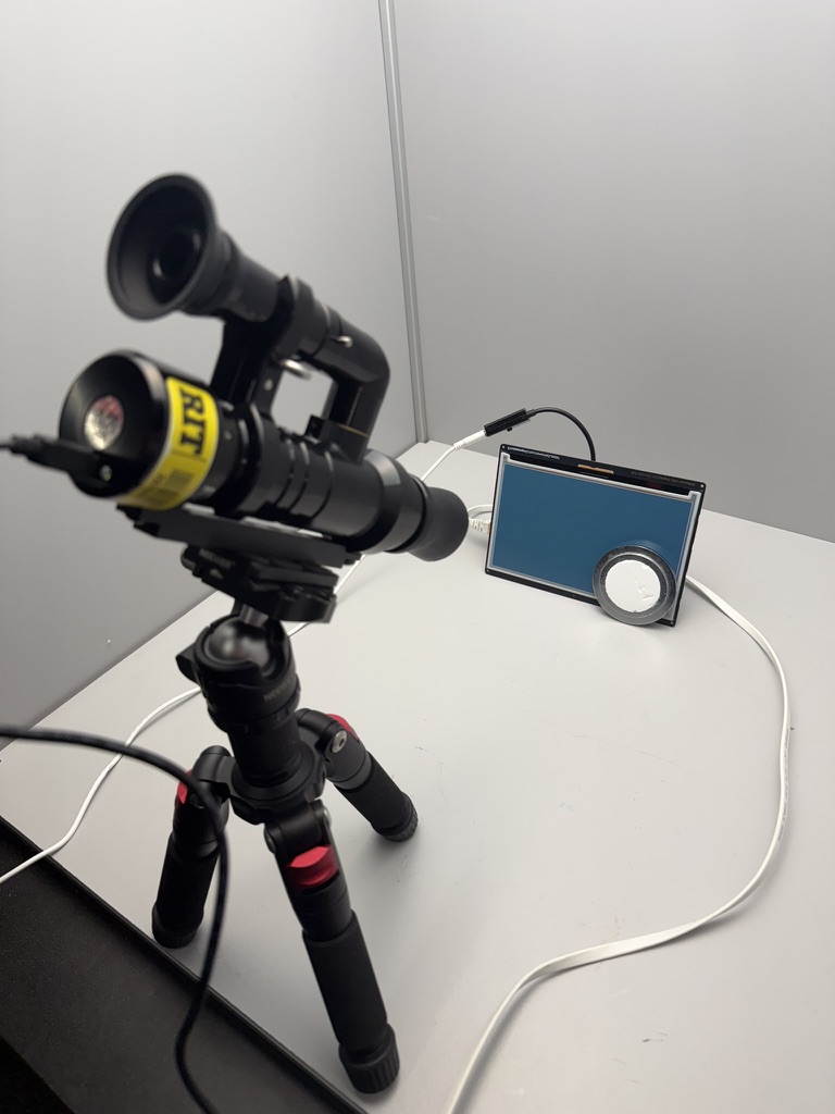
The first meter, an X-Rite i1Pro 3, touches the panel and supplies its own light. Could that contact or illumination contribute to the unexpected readings? To check, I measured selected exact patterns with a Colorimetry Research CR-250, which observes the display from a distance under external illumination.
i1Pro 3: contact reflectance factor. Compares light returned from a small local spot with a calibrated reference, using its own illumination.CR-250: non-contact spectral radiance. Measures light arriving from the display under the booth's external illumination.
A second instrument saw selected pattern changes too. For selected patterns, the spectra changed in a similar direction with the non-contact CR-250 and the i1Pro 3. That makes it less likely that the difference came only from the i1Pro's calculation or readout. But the meters used different spots and lighting, and timing and display history could also matter. The comparison does not rule out the i1Pro's light, contact or sampling of the pattern contributing to its reading, and it does not identify the physical cause.
The instruments report different kinds of measurements, so I compared whether the spectra changed in the same direction, not whether their numerical values matched.
How the instruments and measurement spots were used
To follow changes over time and after another display update, I recorded 108 CR-250 observations alongside i1Pro readings. The CR-250 viewed a different exposed spot on the same display presentation. Some sequences put an i1Pro reading between two CR-250 readings without refreshing the display.
How the instruments were interleaved without changing the screen
CR-250 readingObserve the exposed spot from a distance.
Wait, then read with the i1Pro 3The i1Pro stays in contact; the display is not refreshed.
Another CR-250 readingRead the exposed spot again.
The i1Pro 3 used here is the standard model. X-Rite's specification sheet lists its nominal 4.5 mm measurement aperture. At about 0.20 mm per display pixel, that diameter spans roughly 22.5 pixels. The meter combines light from many pixels. Moving it slightly or shifting the pattern can change which pixels contribute most to the reading.
Simulations that treated the spot as a circle and counted the pixels inside it equally did not explain the observations by themselves. They also did not measure how strongly different parts of the real spot contribute to the meter's signal.
Already measured: CR-250 → i1Pro 3 → CR-250 sequences on an unchanged display presentation. The i1Pro was already touching the panel, and the CR-250 observed another exposed spot.
Still an open comparison: repeat that sequence alongside a matched waiting period with no i1Pro reading. That would help distinguish change associated with using the i1Pro from change that also happens while waiting. The completed interleaving does not provide that matched control. Placing or moving the contact instrument would be a separate test; none of these comparisons alone identifies a single physical mechanism.
The CR-250's radiance and the i1Pro 3's reflectance factor are different quantities. Cross-route comparisons here concern spectral direction, not pooled numerical magnitudes.
Did the difference return when I repeated the patterns and reversed their order?
I automated the display updates and spectral readings. Each four-reading sequence measured both patterns twice. For selected comparisons, I also swapped which pattern came first and last. This let me see both whether the difference returned and whether either pattern changed between its two readings.
Why measure in both ABBA and BAAB order?
Each pattern is read twice. Putting one pattern first and last, then swapping their positions, helps reveal changes associated with reading order or time. It does not make changes over time or effects of earlier images disappear.
ABBA: horizontal at the ends
H
V
V
H
BAAB: vertical at the ends
V
H
H
V
A and B label the two patterns being compared. In this stripe example, A is horizontal and B is vertical. In other comparisons both patterns can be horizontal; the letters still describe reading order, not the pattern's orientation.
Measurement records and technical details
How each reading stays connected to its pixels
Each saved spectrum is tied to the exact source image, packed native buffer, instrument settings, presentation time, and code version. SHA-256 file fingerprints let me verify that repeated constructions really use identical pixels. Raw spectral files and the complete XYZ/Lab results remain available alongside the summaries.
Identical color proportions could give different measured colors
The stripe-width study alone collected 300 optical readings of 90 exact native pixel patterns; later experiments expanded into multicolor layouts, presentation history and image context.
The H/V discovery led to tests of checker layouts, multicolor organization, ordered versus error-diffused white/blue/green pixels, starting position (phase), patterned extent, presentation history and image surroundings. Regrouping three colors changed the measured result while every row stayed horizontal and the proportions stayed fixed. Some rearrangements produced large color differences; others produced small ones. The color pair and the layout both mattered.
The visual map covers 11 investigated situations. H/V stripes are one family, with all 15 native-color pairs available inside it. The results show what changed when pixels were rearranged, held on screen, or placed within a picture.
Pattern behavior map
What changed, what stayed close, and what repeated
The same amounts of native color sometimes measured very differently after rearrangement; other comparisons stayed close. These tests show which was which and whether the contrast appeared again.
If only color counts mattered Patterns with the same amounts of each native color would measure the same regardless of where those pixels were placed or what had been displayed before. That simple starting idea assumes each native color reflects consistently and the meter combines light from the pixels in the same way in every arrangement.
The previews show the actual digital pixel maps, not photographs or measured-color swatches. Fine patterns are enlarged from exact 48 × 32 pixel crops; select one to inspect its full 800 × 480 frame. Inlay and image-context previews show the full frame so their surroundings remain visible. ΔE00 compares the measured colors; RMS compares their spectra. Y is the measured light-level coordinate within XYZ, not perceived brightness. How these measurements describe color.
Spatial arrangement
H/V stripes · where the investigation began
Black / yellow · larger difference
HorizontalVertical
18.24 ΔE00
White / yellow · small difference
HorizontalVertical
0.35 ΔE00
Kept the same
Equal counts of the two native colors within each pair.
Changed
One-pixel rows became one-pixel columns.
The difference depends on the pair
The partner mattered: yellow-containing pairs were prominent, but not uniformly affected. Horizontal was not always lighter.
On repeating: Blue/green’s color gap returned at 3.21–3.39 ΔE00 across four four-reading sequences with the H/V order reversed. A small black/white difference changed spectral direction between sessions. Even when the gap repeats, the two patterns can both have shifted in color.
This complete orientation screen covers every pair of the display's six native colors. Each row compares one-pixel horizontal and vertical stripes with equal color counts. H and V each summarize two i1Pro readings in the stated order. Select a pair to open its four spectra and exact measurement records.
The pair changed the size of the H/V difference. Black/yellow and red/green had much larger color separations than white/yellow and white/blue. Yellow-containing pairs were prominent, but the partner controlled the result, and horizontal was not always lighter. Pairs that stayed small under this test are not universally unaffected: a different construction or measurement condition is a separate question.
Yellow paired with black, blue, red or green gave the four largest spectral RMS differences in this one-pixel set. Color-distance rankings were different: red/green was second by DeltaE00 but sixth by RMS. These describe the commanded color combinations, not a finding that yellow pigment caused the differences. The table shows both rankings, with 1 meaning the largest value in that column.
Swipe or scroll to see all columns →
Selected one-pixel H/V observations, ordered by nominal-D50 DeltaE00. These are individual comparisons, not averages across widths, orders or sessions.
Native pair · digital stripes
H/V measurement sequence
Measured color previews
H–V color distance ΔE00
Spectral RMS pp
Lightness H−V ΔL*
Same-pattern movement pp RMS
Interactive pair details require the measurement data.
The stripe miniatures illustrate digital pixel instructions, not measured appearance. The separate H/V swatches are approximate sRGB previews derived from measured XYZ. Positive ΔL* means H measured lighter; negative means V did. Same-pattern movement compares the two H readings and the two V readings separately, not an uncertainty interval or pass/fail boundary.
What the pair comparison shows
Yellow appears often among the larger observed values. Black/yellow,
yellow/red, yellow/blue, and yellow/green were all among the five largest
color separations. But white/yellow was the smallest result in the table,
so yellow alone does not determine the outcome.
Blue appeared in only one of the five largest rows. Blue/yellow
was large, blue/green was smaller at ΔE00 3.31, and blue paired with black,
red, or white was below ΔE00 1 in this set.
There is no universal lighter direction. The five largest
pairs had a lighter horizontal measurement, while the full 15-pair table
contains both horizontal-lighter and vertical-lighter results. These paired
measurements cannot tell us which individual native color moved.
Blue/green counts matched between H and V at each width.
Changed
Stripe width, including where stripes began and ended at the screen edges.
Smaller gaps, different results on reversal
A selected one-pixel comparison gave 3.31 ΔE00. Two-pixel comparisons gave 0.15 ΔE00 and 0.95 ΔE00 in opposite orders.
On repeating: The gap was smaller with wider stripes here, but its size changed when the reading order was reversed. These results do not show that wider stripes will make horizontal and vertical patterns match reliably.
White/yellow counts matched between H and V at each ratio.
Changed
The percentage of yellow pixels: 25%, 50% or 75%. At each percentage, we compared rows with columns.
Small differences between rows and columns
H/V separations: 0.045 ΔE00, 0.090 ΔE00, and 0.008 ΔE00.
On repeating: Each pattern was measured twice. Rows and columns measured close to each other at all three yellow percentages. That does not yet tell us how to predict the color of any white/yellow mixture, or whether it will return to the same color later.
2.32 ΔE00 between mean colors. The checker moved 3.82 ΔE00 between its two readings.
On repeating: The checker changed more between its two readings than the average checker differed from the average stripe. That makes it hard to attribute their difference to layout alone.
On repeating: For both layouts, the spectrum changed more between repeated readings than it differed between their averages. The small average gap alone does not show that the two layouts will consistently produce the same color.
Cyclic rowsGrouped rowsSeparate row-order test · O1Separate row-order test · O2
Kept the same
Black/yellow/blue counts; all rows remained horizontal.
Changed
Two comparisons: group same-colored rows together; or change row order while keeping color totals and same-color run lengths matched.
Large grouping contrast
Grouping: 15.39 ΔE00; 12.083 pp RMS. A separate test of row order, with the lengths of same-color bands matched: 0.39 ΔE00.
On repeating: The exact cyclic/grouped contrast returned at 15.57 ΔE00 in reverse order; the separate row-order contrast also recurred. Grouping also changed the lengths of same-color bands and where colors met, so the test does not tell us which of those changes mattered.
A regular repeating tile versus an error-diffused layout, with the same amounts of each color distributed less regularly.
Small measured difference
0.14–0.20 ΔE00 across four i1Pro comparisons.
On repeating: Some readings changed as much or more when the same pattern was measured again than when its layout changed. The small gaps therefore do not establish that the two layouts always produce the same color.
Native-color counts, cyclic row order and horizontal axis.
Changed
The pattern’s starting row, called phase.
Small difference after a one-row shift
0.38 ΔE00; 0.242 pp RMS in the selected order.
On repeating: Reversing the reading order produced a difference in the same direction. This tests one starting-position shift, not every possible alignment.
Complete digital frames above, reduced by area averaging to show the changing surround; enlarged stripe crops below. Neither is a measured-color preview.
Kept the same
The H/V stripe rules and equal counts within each sized region.
Changed
Patterned area and white surround changed together; whole-screen counts differ across sizes.
Larger gap across the full screenArea and background changed together
H/V differences inside the small squares: 0.10–0.29 ΔE00; across the full screen: 3.13–3.61 ΔE00, across both orders.
On repeating: All three sizes were measured in both reading orders. Enlarging the colored area also shrank its white surround and moved its edges. We cannot tell from this comparison which change caused the larger gap.
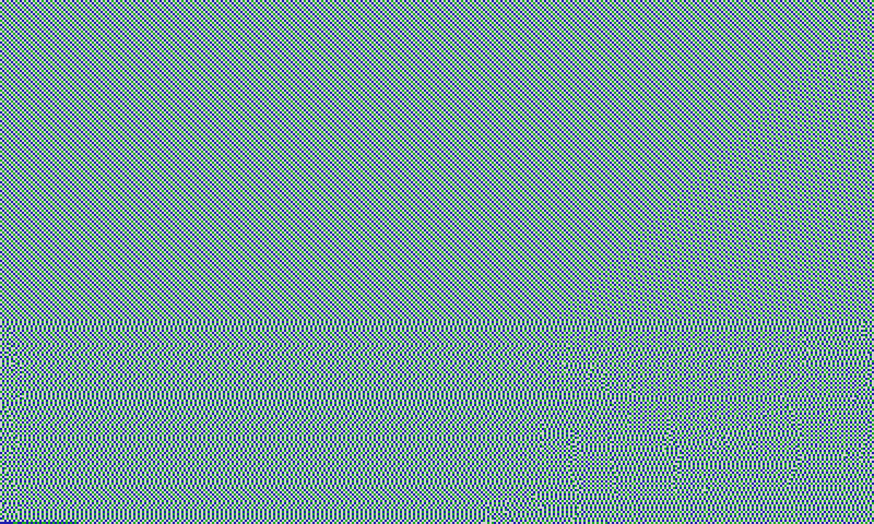
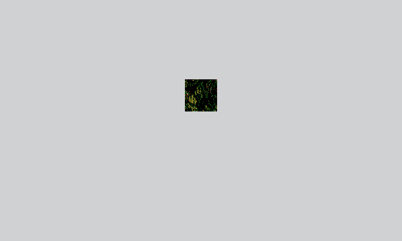
Would the same pixels measure the same color inside a picture and against a white background? The outlined 64 × 64 pixels below are identical in both images; only their surroundings change.
The region within the image
The same region surrounded by white
These are the exact digital pixel maps sent to the display, not photographs or simulations of the measured colors. The outline marks the pixels kept unchanged, not the meter's measurement area.
Kept the same
The exact 64 × 64 central pixels.
Changed
The picture around them was replaced by white.
Same center pixels, different readings
The average measured colors differed by 3.23 ΔE00.
On repeating: We measured the image twice and the white-background version twice. Comparing each image reading with each white-background reading gives four pairings, with a largest difference of 3.33 ΔE00. Those pairings reuse the same four readings; they are not four separate experiments.
Why the cause is still open: The meter collects light from an area, not a single pixel. We measured the patterns, but did not map how much each part of the screen contributed to its signal. This comparison therefore cannot tell us whether the difference came from the surrounding image changing the display's response, the way the meter collected light, or changes during the measurement sequence.
Holding, redrawing, and returning to identical pixels
Blue/green: holding versus redrawing
The same fine horizontal stripes throughout this sequence.
Kept the same
The exact blue/green pixel buffer.
Changed
Another update drawing those pixels, compared with leaving them displayed without an update.
Opposite changes in measured Y
The measured Y value fell after another redraw but rose slightly while held, after each of four preceding images.
On repeating: That direction recurred across the four preceding images, but each hold and redraw episode was observed once and started at a different level. This does not establish a general drift rule or isolate a cause.
The identical pale-red pixel buffer at each return.
Kept the same
The exact pale-red pixel buffer.
Changed
When the pattern returned within a sequence containing other patterns.
Absolute color changed across returns
The identical pale-red pattern did not return to one measured color.
On repeating: The pattern was measured twice at each early, middle and late return. This sequence does not isolate elapsed time from the intervening display history.
Early2 readings
Middle2 readings
Late2 readings
The pale-red pixel buffer was identical at every return. The timeline shows those six readings.
The labels summarize these measurements; they do not say whether a difference would be visible to a viewer. A small difference in one test is not a promise that the patterns will always match.
A recurring difference does not mean that either pattern returns to the same measured color. Some differences repeated, while other readings changed with time or surroundings. These findings motivate testing whether spatial arrangement, surrounding pixels and display history improve forecasts. A future renderer would use that knowledge to reproduce requested colors better. Three open questions guide that next direction.
How spectral contrast varied with stripe width
Wider stripes usually reduced the spectral contrast in this set. For 14 of 15 pairs, the arithmetic mean of the two two-pixel H/V comparisons was below the one-pixel RMS; the two three-pixel comparisons gave the same count. Phase, frame boundaries, and the pattern inside the meter's spot also changed, so width alone is not a general fix.
The color table above compares one-pixel patterns. This plot compares the size of the spectral H/V difference across all three stripe widths and both reading orders. It shows where contrasts became smaller or differed between orders; it does not measure perceptual color distance or prediction accuracy. Equal spacing on the logarithmic axis represents equal ratios, keeping small and large contrasts readable together.
one-pixel patterntwo-pixel patterns, both ordersthree-pixel patterns, both orders
Keyboard: use arrow keys to inspect comparisons; Home and End jump to the first and last. Tab leaves the plot.
This interactive plot requires the measurement data. The findings and example values remain available in the text.
All 15 color pairs across one-, two-, and three-pixel stripe widths.
Each dot summarizes one four-reading horizontal/vertical comparison. Joined dots show the two reading orders, not a range of uncertainty. Select a point to inspect its comparison.
Why a repeated difference is not yet a predictable color
Black/yellow repeated a direction while its size changed
Interactive history details require the measurement data.
The size of the same checker's repeat movement differed
Interactive history details require the measurement data.
Holding an image and drawing it again gave different answers
A displayed image could remain fairly steady while held, yet return to a different color after another update or setup. The direction depended on the pattern. That made presentation history part of the prediction question, rather than a single correction to apply to every color.
Hold the imageLeave the pixels displayed and measure how the reading changes with time.
Draw it againSend another update and measure whether the same construction returns to the same color.
Tests with different preceding images and an extra white update did not reveal a consistent clearing procedure. One proposed reset sequence, blue then white before returning to the same white/blue/green pattern, changed the reading in the opposite direction to the intended correction. Those results narrowed which remedies were worth pursuing; they did not rule out every history effect.
Why waiting, redrawing, and changing the previous image are separate tests
The experiments compared changes within held episodes with changes after another refresh, and also tested returns after different preceding images. The extra-white test did not consistently improve the result, and the white control itself changed on return. A curve fitted to the recorded time trend can describe those readings, but it is not a prediction made before measuring them. Normal display use is still one update followed by a held image.
Exact row organization mattered even without changing orientation
These comparisons extend the same investigation beyond horizontal versus
vertical. They keep the patterns horizontal and ask how the measured color
changes when the row sequence, starting position, and run grouping change.
Together, they show that orientation was only one way exact organization could
change the measurement.
Same counts, different row order
This comparison kept both patterns horizontal and used the same 96,000 black,
192,000 yellow, and 96,000 blue pixels. One four-row period alternated
yellow–blue–yellow–black; the other placed the two yellow rows together as
yellow–yellow–blue–black. The display received two exact pixel arrangements, not
two names for one image.
Cyclic: yellow · blue · yellow · black
Grouped: yellow · yellow · blue · black
Color change with the stripe axis fixed
The cyclic pattern measured lighter
and more yellow in both presentation orders. Its signed Lab change was
ΔL* +15.39 / +15.51 and Δb* +11.04 / +12.04.
Perceptual color distance
DeltaE00 was 15.390 in the first
order and 15.573 in the reversed order. This is an unsigned separation under
nominal perfect-diffuser D50 convention. It describes color separation,
not a visibility or significance verdict.
What the spectrum added
All 36 measured bands pointed in
the same signed direction in both orders. Spectral RMS was 12.083 and
12.200 percentage points.
What repeating the order checked
The two signed spectral
shapes had cosine 0.999900; their vector discrepancy was 0.207 percentage
points RMS. A cosine close to 1 means the spectral changes point in nearly the same direction, even if their sizes differ. Vector discrepancy is the remaining difference between those two change spectra. Movement between repeat readings of the same pattern remains
context, not an uncertainty limit.
Finding: the large
measured contrast is not unique to turning horizontal stripes into vertical
stripes. Overall color counts alone are insufficient to describe these two exact
three-color pixel patterns. This does not prove that adjacency, grouping, or any other
single construction detail caused the difference. These discovery comparisons
did not test a model's absolute-color predictions. The later examples
ask the broader question of predicting color on new inputs.
Compare starting position, grouping, and longer runs
Starting position, grouping, and matched summaries
Six four-reading comparisons separate three questions about organization.
Every
pattern kept the same black/yellow/blue counts and the same horizontal axis.
A run is a band of consecutive rows with the same color.
Boundary density describes how often neighboring rows change color.
Each row remains its own descriptive result because it represents a different
exact comparison; they are not averaged into one rule.
Swipe or scroll to see all columns →
Six completed comparisons, with color distance before spectral RMS
Arrangement question
Order
Color distance DeltaE00
Spectrum difference pp RMS
Same-pattern movement first / second, pp RMS
Move the starting row of the cyclic sequence
ABBA
0.379
0.2425
0.1717 / 0.1051
Move the starting row of the cyclic sequence
BAAB
0.293
0.2110
0.0705 / 0.1298
Change cyclic rows into two-row runsRun length and boundary density change together
ABBA
15.626
12.2002
0.2227 / 0.0946
Change cyclic rows into two-row runsRun length and boundary density change together
BAAB
15.596
12.1601
0.0851 / 0.0247
Compare two arrangements with the same simple summariesSame color counts, same number of boundaries, same counts of each run length, and same counts of which color directly followed which
ABBA
0.385
0.3672
0.0992 / 0.0530
Compare two arrangements with the same simple summariesSame color counts, same number of boundaries, same counts of each run length, and same counts of which color directly followed which
BAAB
0.412
0.3722
0.0281 / 0.0657
Starting row
In this exact family, the 0.2425 / 0.2110 pp starting-phase differences were smaller than the large arrangement and run-grouping contrasts, but each was above both duplicate movements in its order (0.1717 / 0.1051 pp and 0.0705 / 0.1298 pp). Their signed directions also recurred across orders (cosine 0.9896). This does not predict what other starting positions would do or identify the physical cause.
Run grouping and boundaries
The large 12.2002 / 12.1601 pp difference recurred with nearly identical signed spectral direction (cosine 0.999986). Run length and boundary density changed together, so neither is isolated as the cause.
Matched simple summaries
The smaller 0.3672 / 0.3722 pp difference also recurred in direction (cosine 0.995871). Matching those summaries did not make the exact arrangements measure identically.
Combined finding:
horizontal versus vertical was the opening clue, not the whole phenomenon.
Exact fixed-axis arrangements can also measure differently. The experiment
shows that keeping the horizontal direction fixed does not keep the measured
color fixed. It does not yet tell us why, or how to predict another arrangement.
Longer row groups did not produce a proportional response
The comparison set repeats the cyclic-versus-two-row comparison, then compares
two-row and four-row runs in both presentation orders. The exact black/yellow/blue
counts and horizontal axis stayed fixed, while run length and boundary density
still changed together.
Swipe or scroll to see all columns →
Three comparisons of row grouping, with color distance before spectral RMS
Arrangement question
Order
Color distance DeltaE00
Spectrum difference pp RMS
Same-pattern movement first / second, pp RMS
Compare cyclic rows with two-row runsRepeated alongside the longer-run comparisons in the same measurement sequence
ABBA
15.588
12.1619
0.0827 / 0.0969
Compare two-row runs with four-row runsRun length and boundary density change together
ABBA
2.257
0.8491
0.0528 / 0.0555
Compare two-row runs with four-row runsRun length and boundary density change together
BAAB
2.290
0.8591
0.0464 / 0.0390
The large contrast recurred
The 12.1619 pp cyclic-versus-two-row comparison pointed in almost the same signed spectral direction as the corresponding ABBA and BAAB rows (cosines 0.999992 and 0.999997).
The two-row-to-four-row contrast repeated
The two-row-to-four-row comparisons were 0.8491 and 0.8591 pp with cosine 0.99982394, magnitude ratio 1.01183170, and signed-vector discrepancy 0.01891485 pp RMS.
The change was not proportional
The two-row-to-four-row difference was about 7% of the cyclic-to-two-row difference's RMS and its spectral shape differed (cosine about 0.44). Run length and boundary density changed together; these observations do not define a proportional scaling law.
How this informed prediction:
these comparisons motivated testing whether models could predict absolute color on new arrangements. The
discovery rows still cannot establish a renderer rule or ICC correction by
themselves.
Larger blocks did not always bring arrangements closer
A separate comparison used equal amounts of white, black, green and blue. It compared a regularly repeating arrangement with an irregular, computer-generated arrangement at two block sizes. With 2 × 2 same-color blocks, their measured colors were close; with 4 × 4 blocks, the difference was larger in both reading orders.
Color distance between the regular and irregular arrangements, DeltaE00
Same-color block
ABBA
BAAB
2 × 2 pixels
0.226
0.123
4 × 4 pixels
2.241
2.172
Enlarging the blocks also changed local color proportions and edge positions within the nominal measurement area; the meter’s exact spatial weighting was not established. This result argues against assuming that larger blocks always reduce arrangement-dependent differences, but it does not isolate block size as the cause.
Next direction: prediction-guided rendering
Prediction-guided rendering is work in progress, not a completed solution. The measured behavior raises three open questions: which patterns remain predictable, whether that knowledge transfers into images, and whether it helps choose pixels that reproduce requested colors better.
Choose native pixels that improve color while preserving image structure.
Technical details: prediction trials and a case-specific renderer adjustment
Payload · what we send
The exact native-state pixel map, encoded for the display. A renderer or a test-pattern generator chooses these pixels.
Prediction · what we expect
A model's estimate of the color those pixels will produce under stated conditions. The models below predict XYZ color coordinates.
Measurement · what we observe
The light recorded by the meter: a spectrum, converted to color coordinates. This is what tests the prediction.
Different models can predict different colors for the same unchanged payload. Making a forecast does not change the pixels. The requested image color is a separate goal: we check both how well we predicted the output and how closely that output matches the goal.
In questions 1 and 2, prediction error means the DeltaE00 distance between a saved forecast and a fresh measured color. Those two tests chose a limit of 1 before measurement, using nominal-D50 Lab. That is an engineering criterion for those tests, not a universal visibility threshold. Question 3 also checks distance from the requested color, labeled separately.
1 · Can we predict a construction's absolute color?
Why we tested it
A renderer needs to know the color its pixels will produce, not just whether two patterns will differ. Useful predictions must work on new inputs and remain useful when familiar patterns return.
What we saw
For 14 new colors measured twice, a model based on proportional departures from a simple native-color mixture reduced average prediction error from 6.73 to 2.69 DeltaE00 compared with directly averaging measured colors. Yet each method met the chosen limit on only 2 of 28 readings. Both forecasts concerned the same unchanged pixels.
What it tells us
The ratio model improved average prediction in this test. Learning how measured mixtures depart from a simple native-color estimate is useful, but average improvement is not dependable accuracy.
What remains open
Reliable new-color prediction is not established. The same pixel maps also did not return consistent colors across occurrences, so the intended conditions and display history must be considered when defining where a prediction applies.
Next test
A future model should add a specific missing input or a new pixel construction. Its forecasts would then be tested on both new inputs and familiar returns under defined conditions. Repeating the same method alone would not answer what information is missing.
What would an absolute-color model need to know?
Native-state contributionsWhich colors, in what proportions?
+
Spatial constructionArrangement, grouping, phase, and local context.
+
Display and measurement conditionsPrevious updates, timing, setup, and any environmental terms supported by tests.
Predicted absolute color: XYZ → LabCompare each fresh reading with its prediction. A spectral model can also predict the wavelength-by-wavelength response.
A working hypothesis about possible model inputs, not a validated recipe. Which arrangement and condition terms matter remains open. The empirical forecasts discussed here predict XYZ directly.
The direct model averages measured XYZ from nearby inputs. The ratio model averages how those measurements differ proportionally from a native-color estimate, then applies that ratio to the new input's estimate. The two approaches were compared with forecasts saved before the new readings. Neither changes the displayed pixels by itself.
2 · Does the prediction transfer into an image?
Why we tested it
Full-screen patterns help investigate particular dependencies, but ordinary images contain many constructions next to one another. A forecast that works on an isolated pattern may miss a region inside a picture.
What the methods use
Both methods use the proportions of native states in the same selected 64×64 digital region. The additive baseline weights measured native-state XYZ values by those proportions. The learned local model adjusts that estimate using how previously measured mixtures departed from their additive estimates. This tests prediction inside an image, rather than another uniform patch.
What we saw
In a test with forecasts saved before measurement, six selected regions from three previously unused images were each measured twice. The learned local model was closer than the additive baseline on all 12 readings, but neither method met the chosen limit on any reading.
What remains open
Dependable image-region prediction is not established. The images were unchanged: this did not test improved rendering or whole-image quality, and it did not identify a physical cause.
Next test
When a new candidate has a clear reason to improve, save its forecasts before measuring held-out regions and their returns. Use varied tones, textures and surroundings to test the specific information the new method adds, with a fixed renderer and a finite evaluation set.
3 · Can predictions help reproduce the requested image?
The practical goal is to use what we learn about the display to choose native pixels that bring measured colors closer to the image's requested colors, while preserving tone, detail, texture and edges.
A fixed adjustment helped the warm color but worsened the neutral
In an earlier two-color experiment, I used previous measurements to adjust the renderer's input for a warm tone and a neutral gray. This was a fixed, case-specific adjustment, not a general predictor choosing pixels.
Distance from the original desired color, in DeltaE00. Each range covers four fresh readings; lower is closer.
Test color
Baseline rendering
Adjusted rendering
Warm tone
6.24–6.65
2.86–2.98Closer on every reading
Neutral gray
5.51–5.87
6.17–6.51Farther on every reading
The adjustment did not improve both colors. Its saved output forecasts also missed the chosen limit on all eight readings. Every adjusted result remained above the test's original-color error limit of 1. The warm improvement was useful, but it did not establish a dependable correction for other colors.
Both versions were compared with the same original desired color for each case. These patterned test patches did not test whole-image quality or establish the closest colors the display could reproduce. Inspect the readings and forecasts.
Predicting a color is not the same as reproducing it
A separate construction in that experiment had an accurate output forecast but still missed the desired color. Its forecast was saved before four fresh measurements; the first reading is shown here.
Original desired colorD50 XYZ: 16.485 · 15.565 · 7.728
First fresh measurementD50 XYZ: 14.291 · 12.578 · 5.426
Forecast ↔ measured outputDeltaE00 0.41Within the preset engineering limit of 1.
Requested ↔ measured outputDeltaE00 5.96Outside the same limit.
All four fresh readings told the same bounded story: forecast error was 0.38–0.47 DeltaE00, while requested-color error was 5.81–5.96.
Retained four-reading warm-color test. The requested color and saved forecast were fixed before the fresh measurements. Swatches are approximate sRGB previews computed from the printed D50 XYZ values; the numerical comparisons carry the result. This one construction explains the distinction between prediction and reproduction. Broadly improved reproduction remains open.
All four fresh readings
Fresh measurements in acquisition order
Reading
Measured D50 XYZ
Forecast error
Requested-color error
1
14.29114 · 12.57847 · 5.426062
0.4089
5.9641
2
14.24502 · 12.54802 · 5.422607
0.3914
5.9523
3
14.39455 · 12.68825 · 5.477240
0.4711
5.8099
4
14.28953 · 12.60059 · 5.436232
0.3792
5.8571
For prediction-guided rendering, forecast accuracy and requested-color accuracy answer different questions. Dependable prediction-guided reproduction across new images has not yet been demonstrated.
What comes next? Test whether a selected correction helps on fresh colors and images, with its forecasts fixed in advance. Evaluate requested-color error alongside tone, detail, texture and edges.
A path toward predictable image color
What began as an experimental profile evaluation became a test of how exact pixels produce color. Repeated controlled comparisons reproduced differences, and fixed-axis three-color patterns showed that orientation was only one part of the problem. The current aim is better color reproduction, through parallel work on prediction and direct image comparisons. We can test which constructions are predictable, whether forecasts transfer into images, and which rendering methods produce more useful pictures. Image comparisons do not have to wait for prediction to succeed.
Controlled constructionsDesign comparisons that isolate particular dependencies in pixels, timing or conditions.
Held-out image regionsTest forecasts on content and returns not used to choose the method.
A fixed renderer comparisonMeasure whether a baseline and candidate differ in requested-color error and preservation of image structure.
Experimental characterizationFreeze a candidate renderer/display condition for experimental characterization, then test the profile on fresh images.
The first experimental ICC profile characterized an earlier rendering-and-display setup. A later experimental profile would describe the color response of a declared candidate process being evaluated. It would not execute the renderer or automatically receive missing spatial, context or display-history inputs. The ICC profile specifications define that interchange format.
Established
Some exact pixel constructions measured differently. The initial profile improved its tested color grid.
In progress
Improving color forecasts alongside direct tests of which rendering methods better reproduce the requested colors and image structure.
Still unknown
Dependable transfer across new content and returns, broadly improved image reproduction, and the physical cause of the observed dependencies.
Next checkpoint
Test forecasts that include image surroundings, and separately compare fixed rendering methods on images.
What I want to test next
The investigation is still in progress. These next tests are planned and depend on access to the display and instruments. They ask three different questions:
Which color pairs change when stripes become checkerboards?
Stripes have been measured for all 15 pairs, but checkerboards only for selected pairs. Use those results to identify the missing comparisons, then measure fresh stripe controls alongside the new checker readings so the layouts can be compared under the same conditions.
Does including the surrounding image improve a color forecast?
Test a model that adds information about surrounding pixels to its estimate of the measured region. Its method and forecasts are fixed before the new readings, so the test can show whether that extra information helps on fresh image outputs.
Which rendering route makes a more useful picture?
Compare fixed rendering methods on known images. Measure local color error and examine tone, detail, texture and edges. This is a separate test from forecast accuracy: a predictable output can still be the wrong color, and a lower color error can still come with lost detail.
Other pattern questions to explore later
Later comparisons could vary checker size and starting position (phase), rectangular and diagonal layouts, arrangements that change both row and column sequences, color proportions, regular patterns versus error diffusion, and the size of a patterned region within its background.
Three- and four-color tests would also change which color occupies each part of an uneven pattern: a narrow band and a wider band give a color different neighbors. The yellow/blue/yellow/black one-pixel pattern was already measured as both rows and columns. The longer two-row and four-row groups shown here were horizontal; testing their matched column versions remains a more specific question.
How the experimental renderer differs from the Pimoroni baseline
An offline experimental foundation uses measured native-color references and diffuses XYZ error while choosing pixels. Models for composite outputs and their usefulness in images remain under investigation; this implementation is not a measured general-image improvement.
Decision
Pimoroni baseline used here
Experimental direction
Interpret image color
RGB values, with source-profile conversion upstream.
Explicit source-profile conversion or declared sRGB, then D50 color coordinates.
Choose native states
Nominal RGB references and nearest-RGB selection.
Measured references and colorimetric coordinates; validate composite-output models before relying on them.
The implemented baseline diffuses XYZ error. Any model-guided replacement must also preserve image detail.
This display has been slower and harder to characterize than I expected. Each pattern needs an update, time to settle and repeated measurements. That challenge has made the work a rewarding way to connect color science, software and experimental design: understand the output well enough to make better choices when rendering an image.
Explore the measurements behind the investigation
For a closer technical look, the atlas keeps the individual spectra, color coordinates, forecasts and experiment history. Browse stripe width, proportions, arrangement, surroundings, instruments or prediction; this depth is optional, not a prerequisite for following the three questions.
The original 75 stripe comparisons remain available by color pair, width and reading order. The topic selector opens the broader experiments and later prediction tests.